Digging into White House Staff Financial Disclosures

When ProPublica and the New York times published the White House staff financial disclosure forms last week, I wanted to dig into the data myself and understand where President Trump's advisors financial interests lie.

As a first step, I wrote an R script to wrangle the PDFs that ProPublica received into columnar tables. I then used Data Studio to aggregate all of the available disclosures and visualize the data with segmentation options (e.g. male vs. female staff).

Take a look at the final product here: goo.gl/or9lj8.

Handcrafted Data Viz

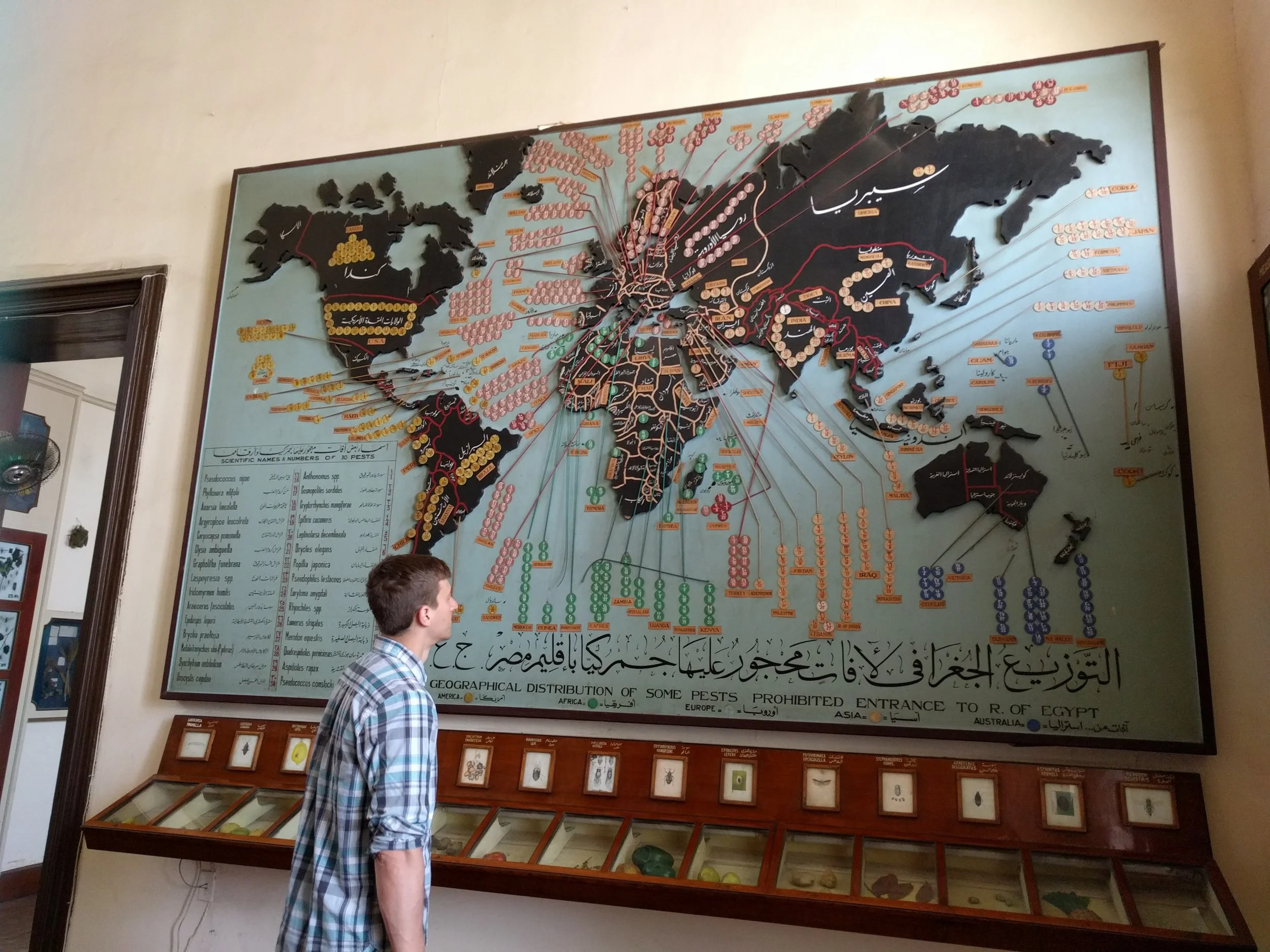
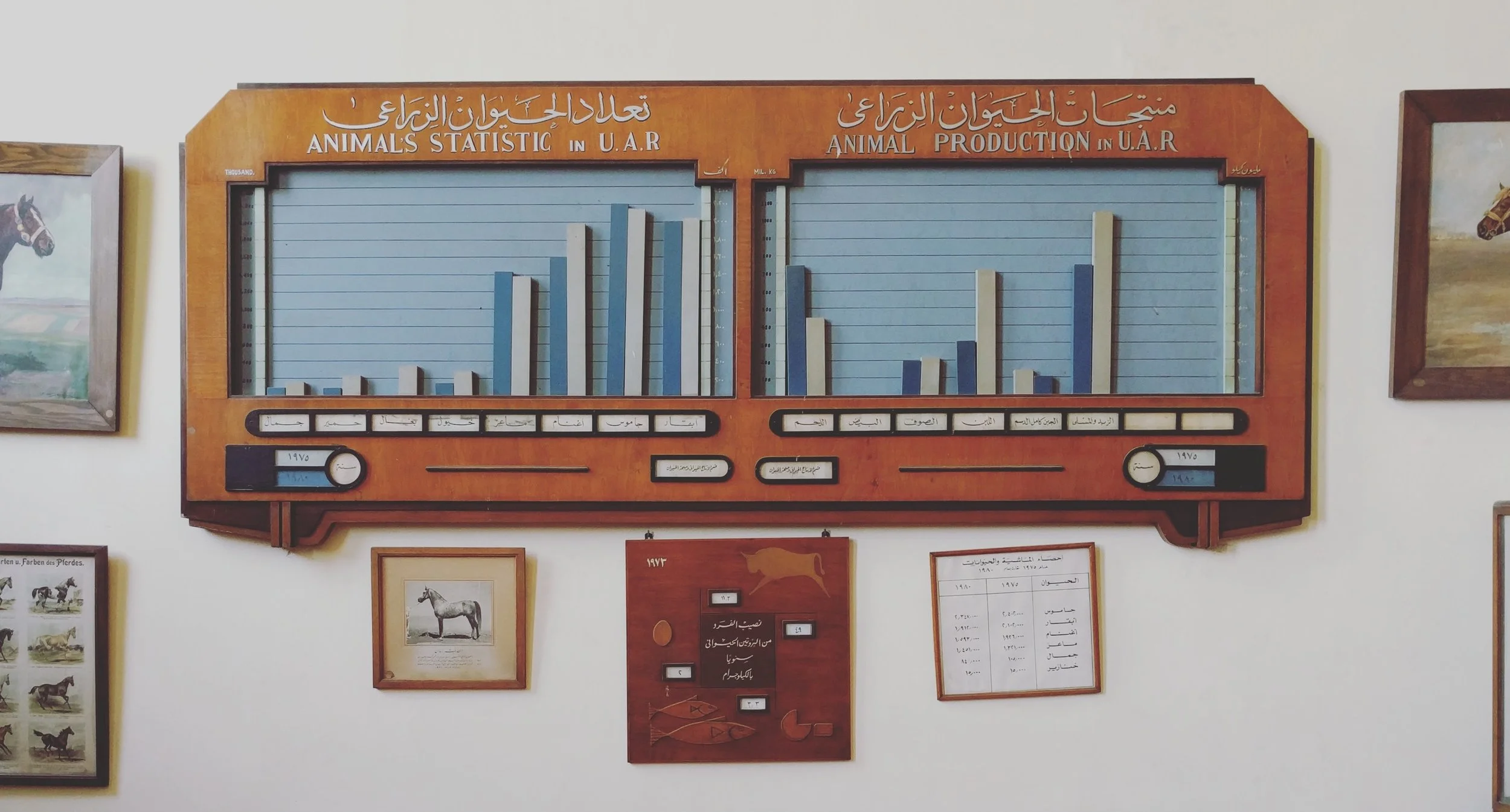
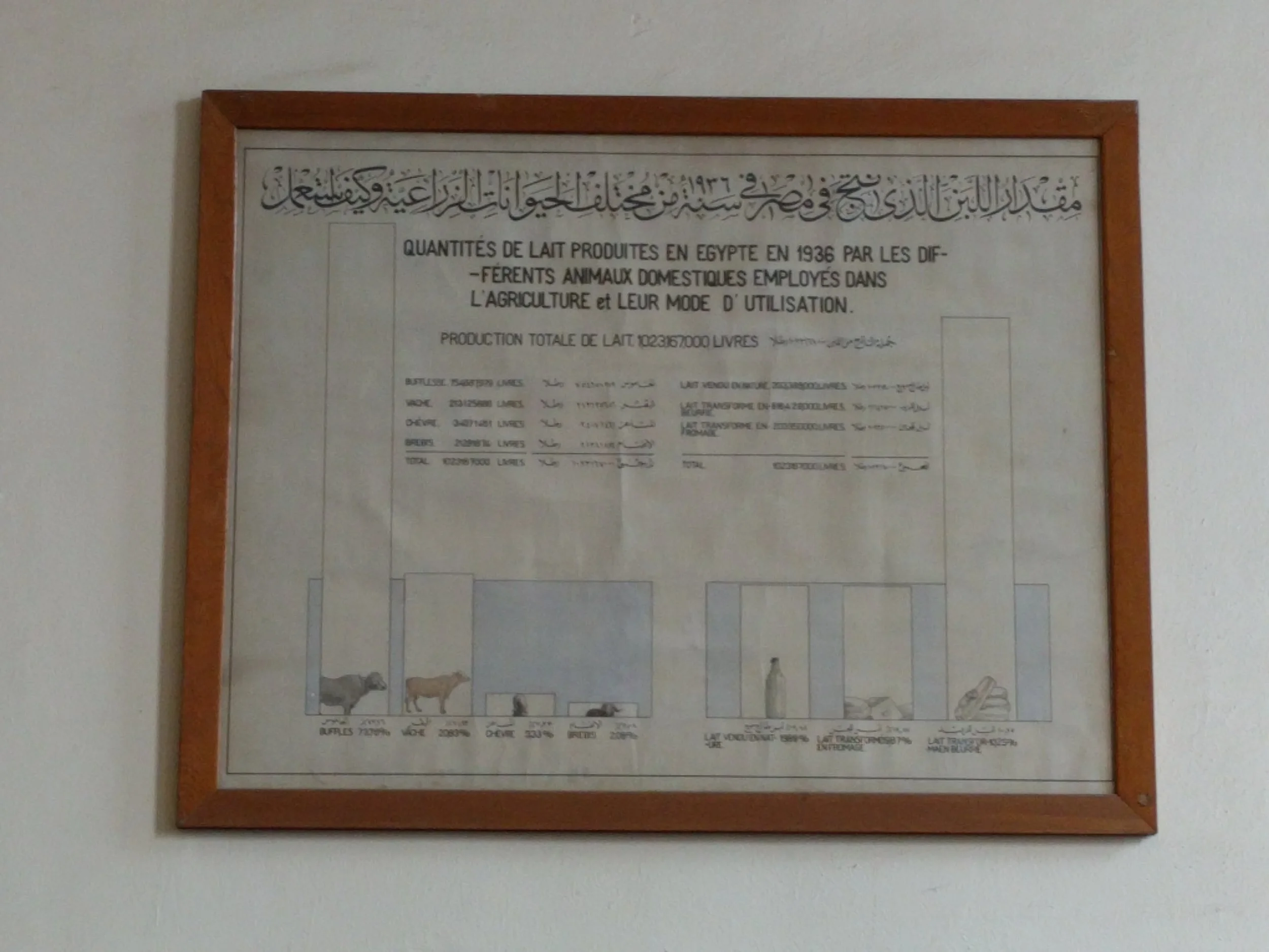
One of the most overlooked tourist attractions in Cairo is the Agricultural Museum, which has become a time capsule of mid 1900's museum curation. Amongst the overwhelming amount of taxidermy, wax figures, formaldehyde, and dust, the museum displays some beautifully handcrafted data visualizations of agricultural production trends. I captured a few photos of the more intricate ones as an inspiration for my own work and a reminder of how much effort such work used to require!

Trump Tweet Tracker in Data Studio

Trump's Twitter obsession certainly isn't new, but my obsession with monitoring his harried tweet stats is. Want to play along? Made an interactive tool at goo.gl/6qSqYF that I'll be updating daily.

Since inauguration...

  • 178!!! tweets
  • Top liked tweet was his support of "peaceful protests"
  • Least liked tweets include criticism of Obamacare and repeal of anti-corruption rule (H.J. Resolution 41)
  • 21 tweets about fake news & media vs. 7 about jobs